Five Years of Woodstock Inn Brewery Can Design
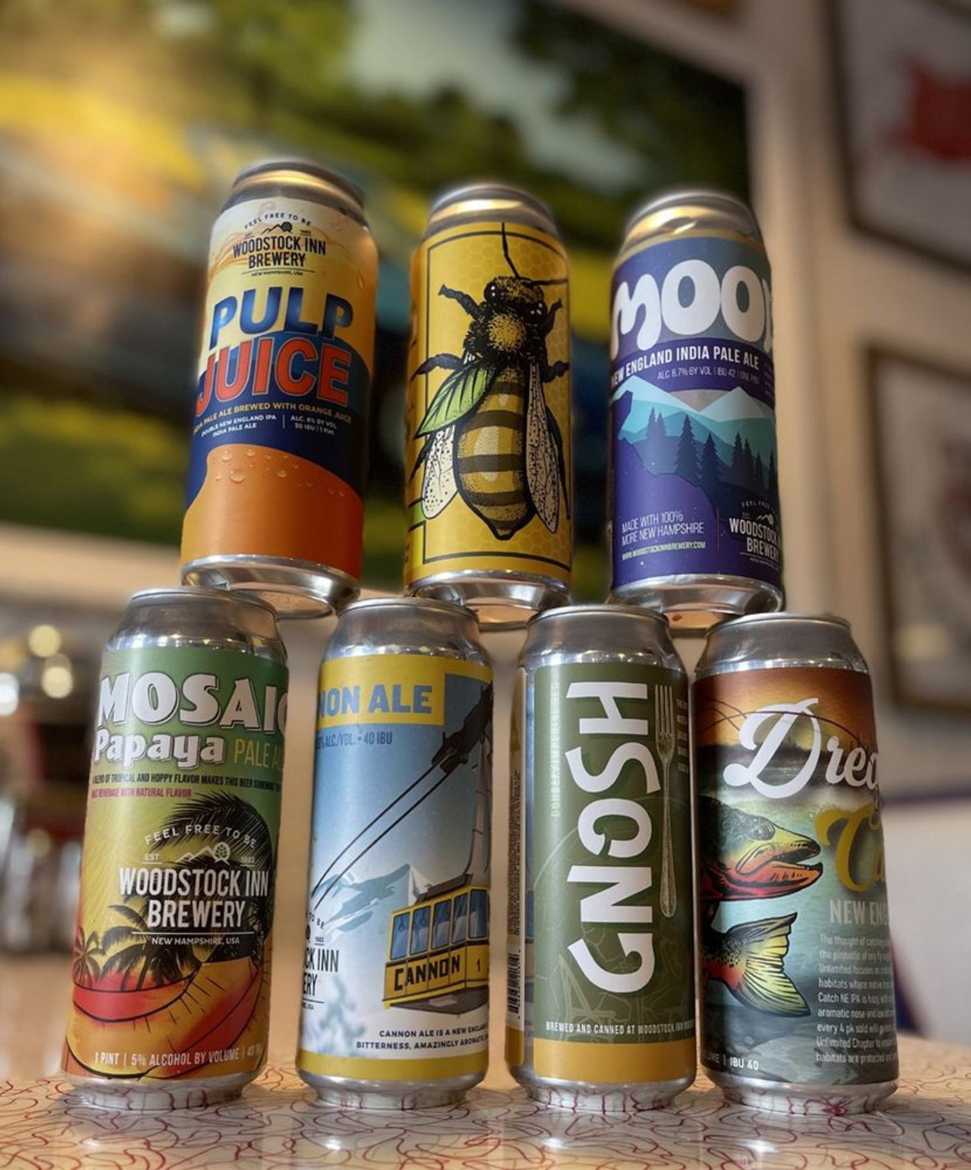
There’s something wonderfully unforgiving about designing a beer can.
It has to look great from six feet away. It has to look great in someone’s hand. It has to feel like part of a family while still having enough personality to stand on its own.
Oh, and it’s cylindrical. Because apparently rectangles would have made things too easy.
For more than five years, Boston Impressions has had the opportunity to help Woodstock Inn Brewery bring its beers to life through can design. And it has become one of those relationships we particularly love.
One brewery. A lot of personalities.
A growing brewery doesn’t just have one product. There are flagships. Seasonals. Special releases. Experiments. Old favorites. New ideas somebody inevitably dreamed up over a beer.
Each one needs its own personality, but when they sit together on a shelf, they still need to look like they came from the same place. That’s where the interesting part begins.
Our job wasn’t to create a collection of unrelated pieces of artwork. It was to help build a visual family. Something flexible enough to keep evolving without losing the character of Woodstock Inn Brewery.
Consistency without sameness.
Brand consistency is one of those phrases that can make creative people nervous. Taken too far, consistency becomes predictability. And predictable is not exactly what you want when someone is scanning a cooler full of craft beer.
So the challenge became finding the balance. Keep enough familiar DNA that customers recognize Woodstock. Then give each beer permission to have some fun.
Different typography. Different illustrations. Different colors. Different attitudes. Same family.
Think siblings, not clones.
Design has a job to do.
We love making things look good. We are, after all, designers. But packaging has a bigger job. It has to get noticed.
Craft beer is an incredibly visual category. A customer may encounter dozens, sometimes hundreds, of choices before deciding what comes home with them.
The can needs to communicate quickly. What is this? Who made it? What does it feel like? Is this my kind of beer?
Great packaging can’t answer every question. But it can absolutely earn the pickup. And sometimes that’s the first step toward earning a new customer.
Five years means something.
One project is great. A five-year creative relationship is better.
Because over time, you stop simply designing for a brand and start understanding how that brand thinks. You know what belongs. You know what doesn’t. You know when to push harder. You know when to leave something alone.
And you build a body of work rather than a collection of individual projects.
Looking back at the Woodstock cans we’ve created over the years, that’s probably what we enjoy most. They’re all different. But somehow they all belong together. Much like the beers themselves.
Here’s to the next one.
Some of our favorite client relationships are the ones where we never quite know what will land on our desk next. A new beer. A new name. A new idea. A new can waiting to become something.
After five years, we still get excited when another one shows up.
Which either means we really enjoy packaging design... or we’re just very committed to research. We’ll let you decide.